NO
SecureDecisions-Horn-MC1-video.wmv
SecureDecisions-HORN-summary.pdf

Areas of concern:
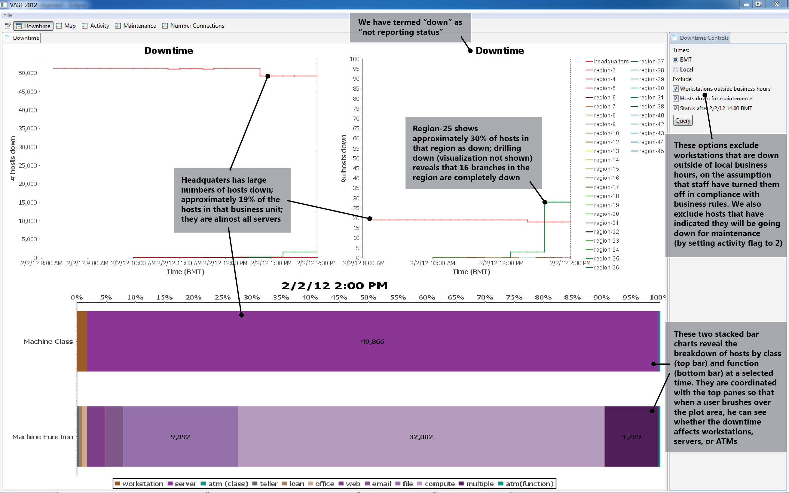
1. Headquarters (HQ) and Region-25 exhibit many hosts that are not reporting status.
Figure 1 shows that within the HQ business unit, approximately 19% of servers appear down. They may not actually be down; all we know for sure is that there is no status report. Drilling down* into HQ using the same visualization (facilities become the data series lines, in place of business units) reveals that approximately 96% of hosts in Datacenter-5 appear down at 2/2 14:00 BMT. The same drill-down for Region-25 (plus the Figures 3 and 10 visualizations), shows that all hosts in 16 branches (2, 3, 4, 8, 9, 14, 20, 23, 27, 30, 33, 39, 42, 44, 47, 48) are down.
*Drill-down visualization is shown in Figure 9.
Areas of concern:
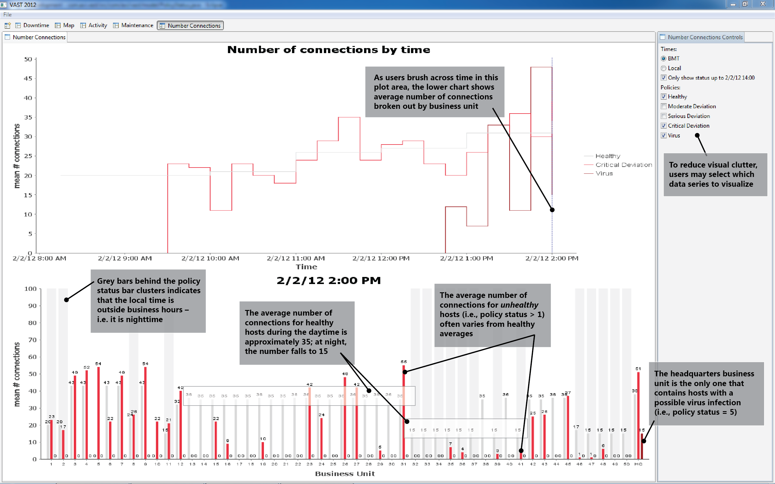
2. HQ contains hosts with a possible virus infection.
3. Many business units (3, 4, 5, 7, etc.) exhibit hosts with both critical policy deviations and abnormally high average numbers of connections.
4. Many business units (16, 19, 29, 35, etc.) exhibit hosts with both critical policy deviations and abnormally low average numbers of connections.
The top of Figure 2 shows the average number of connections per host at a given policy status, over time. The bottom shows these averages by business unit.
Areas of concern:
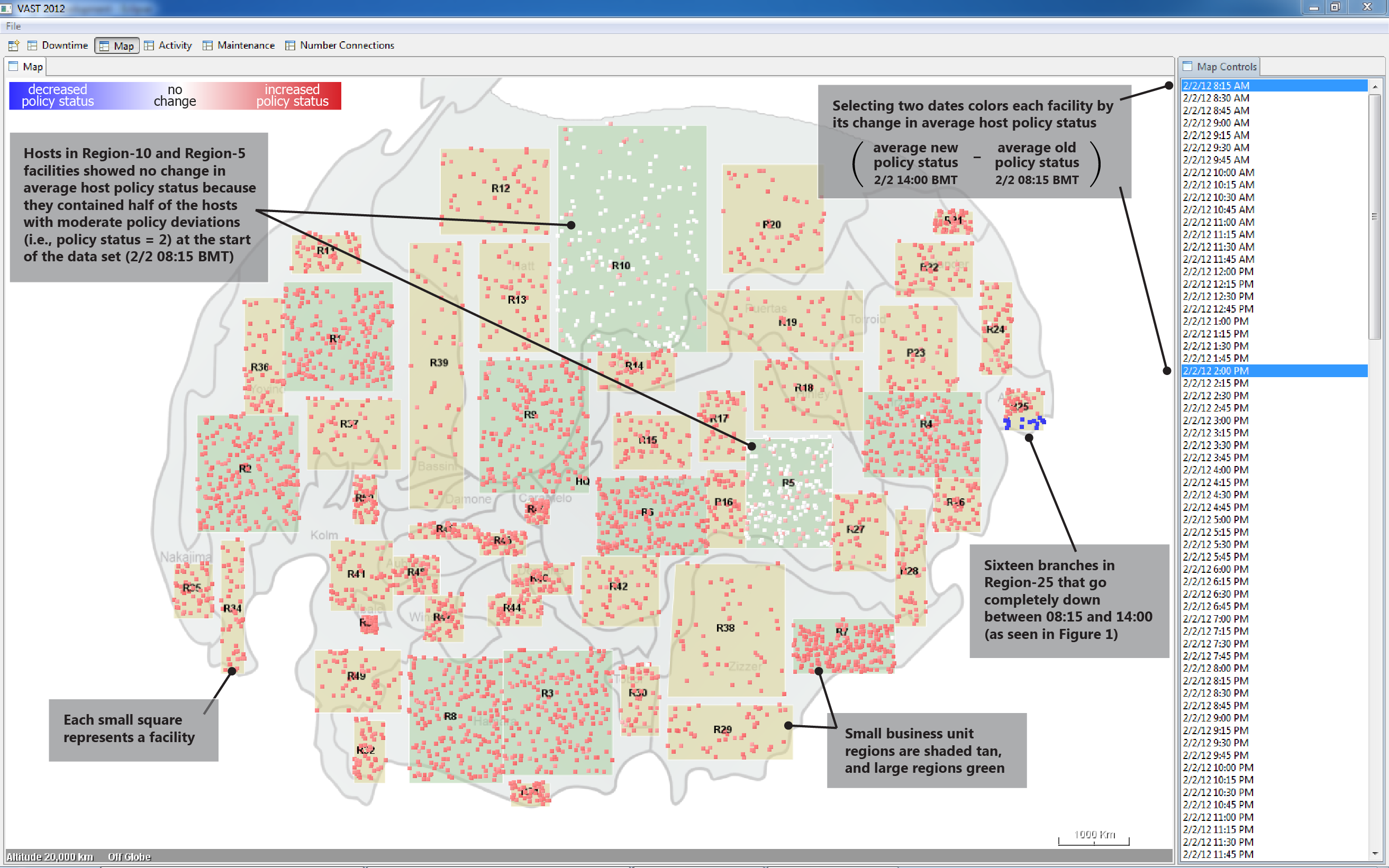
5. Between 2/2 08:15 BMT and 2/2 14:00 BMT the average policy status within most facilities increased.
6. Hosts in Region-5 and Region-10 facilities exhibited higher initial average policy status than hosts in other regions.
Potential anomalies:
1. Policy status gets uniformly worse over time
| BEGIN | 2/2 08:15 BMT |
| END | no end observed |
| EXPLANATION | Network-vectored unhealthiness spreads across the enterprise and causes host policy status values to trend upward. This unhealthiness seems to most likely be some form of worm or other self-spreading malware. |
We tried to find variables that correlate with changes in policy status and downtime. We sought out patterns in IP space, geography, activity, and number of connections. We abandoned lines of inquiry, for example patterns of activity in IP space, when ad-hoc SQL queries failed to support our early hypotheses.
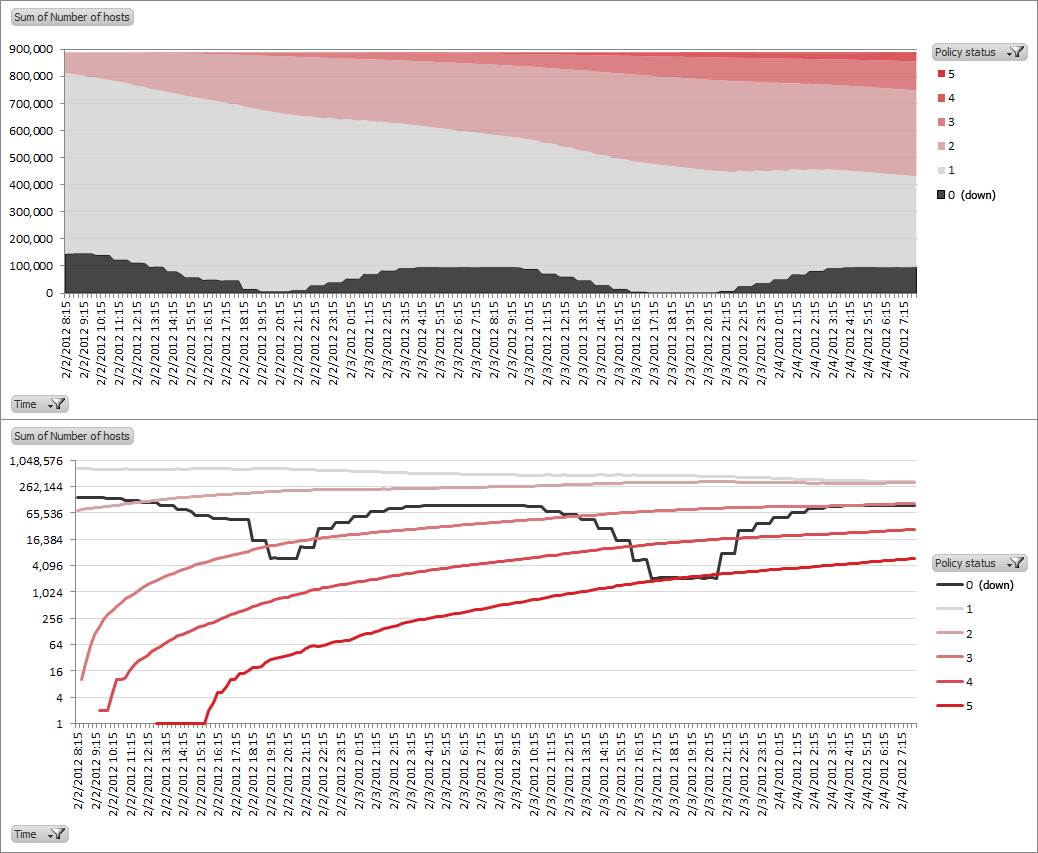
Over time, hosts become unhealthy (i.e., policy status increases); no host ever shows improvement.
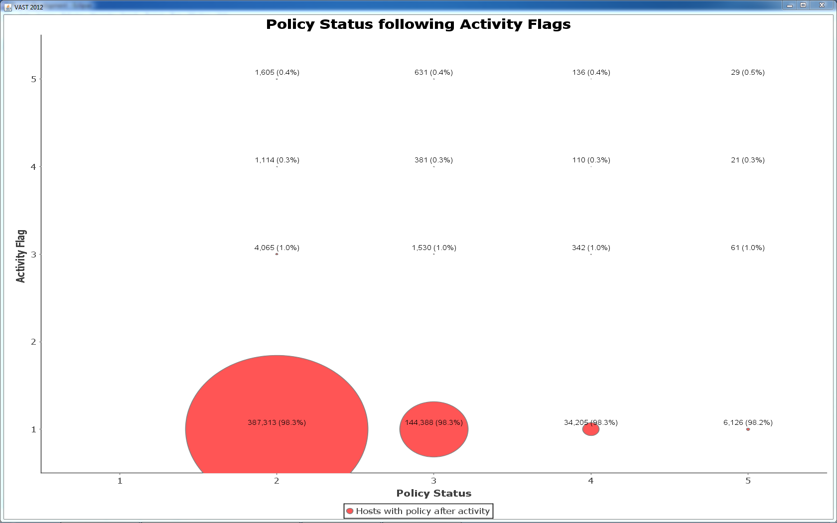
We looked to see if activities were correlated with subsequent policy escalations. 98% of policy status escalations are preceded by a normal activity. This suggests that spread of unhealthiness is not predicted by host activity (i.e., invalid login attempts, device added, etc.).
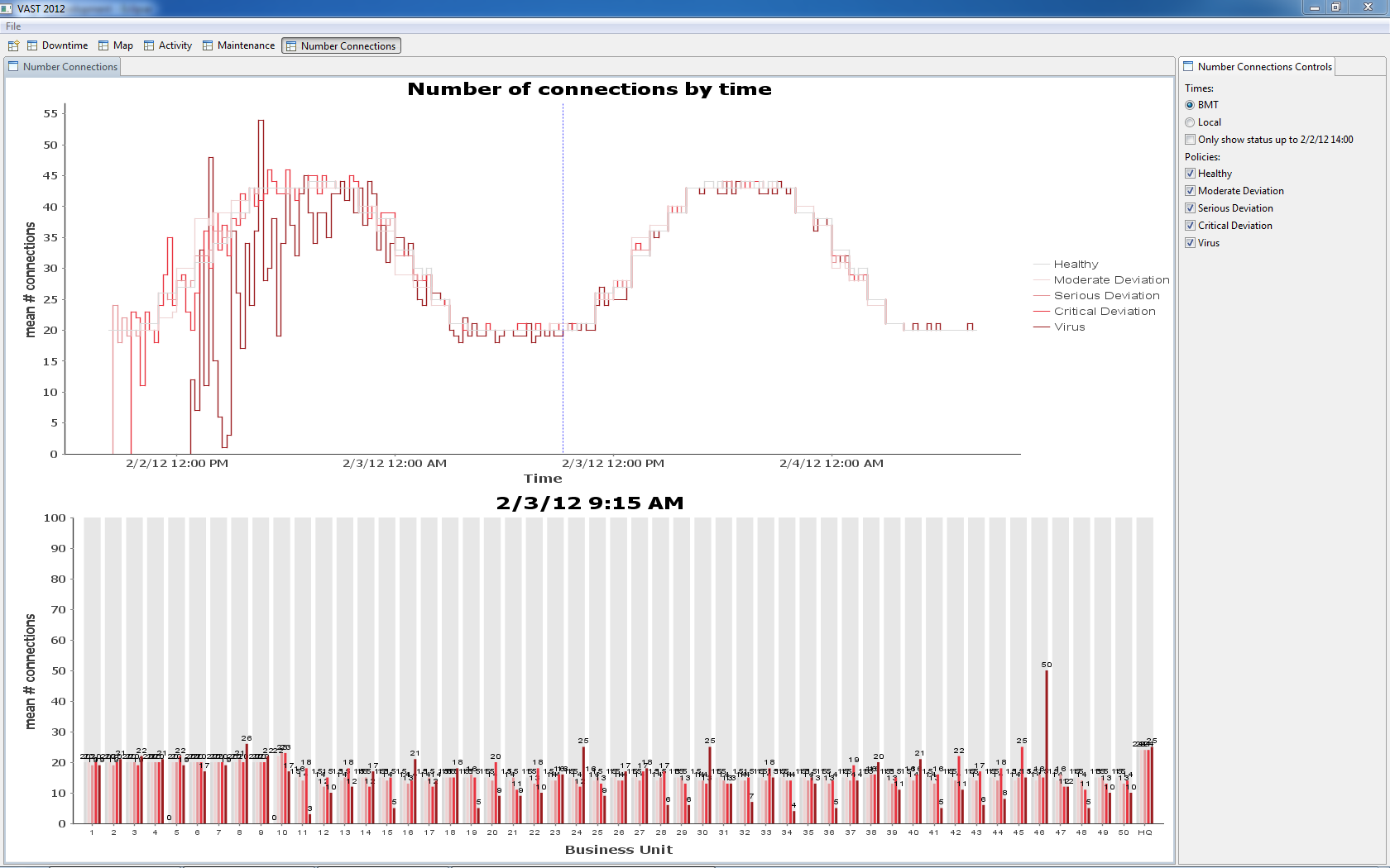
By 2/3 09:15 BMT, all facilities contain hosts with a possible virus infection (policy status = 5). The increase in number of unhealthy hosts can be seen on the left edge of the chart – unhealthy hosts support a growing number of connections.
2. Maintenance backlog builds at night
| BEGIN 1 | 2/2 13:45 BMT | BEGIN 2 | 2/3 21:00 BMT |
| END 1 | 2/3 16:45 BMT | END 2 | no end observed |
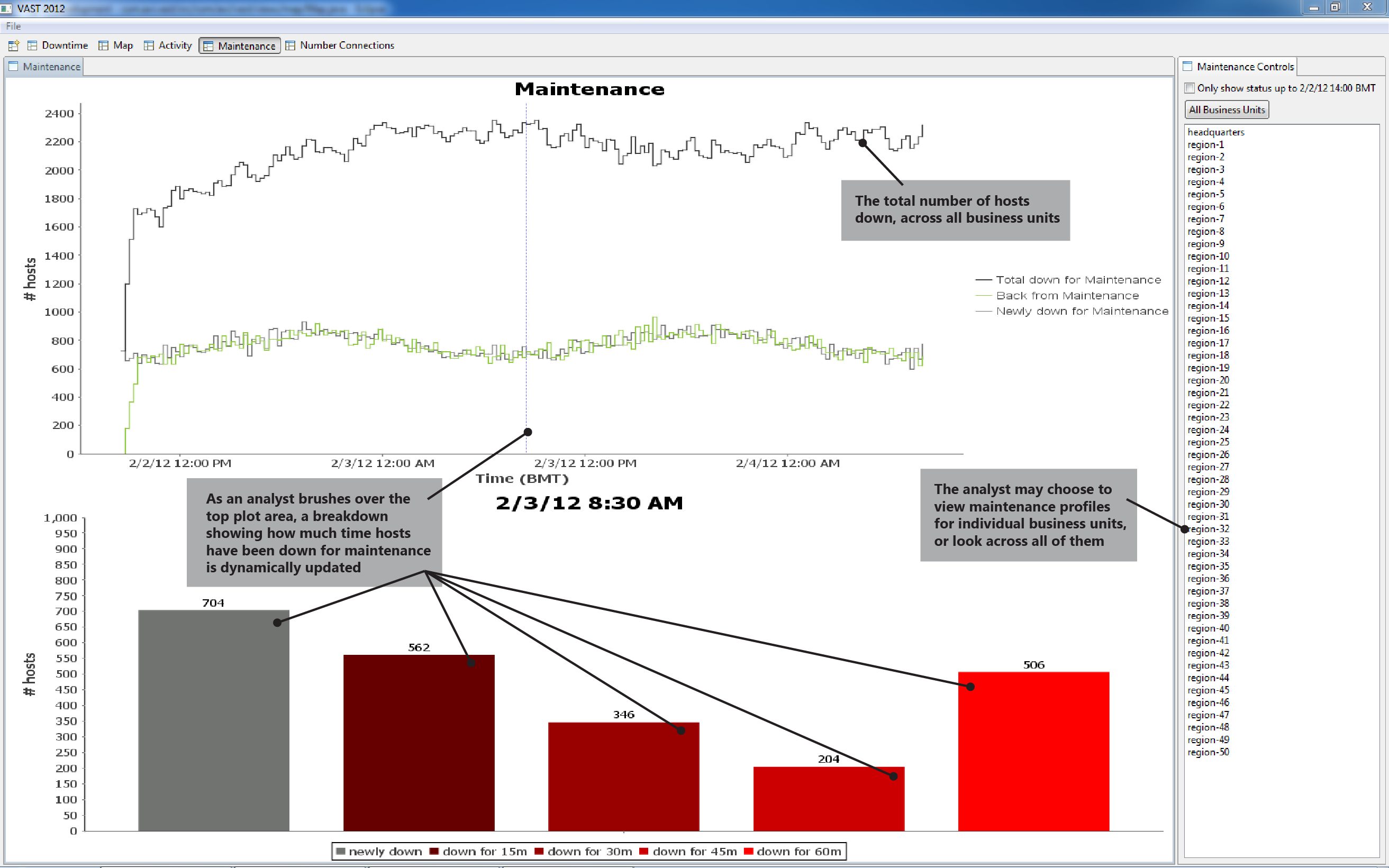
| EXPLANATION | The time duration under maintenance grows at night, presumably as smaller, graveyard shifts are unable to keep up with maintenance demands. At daybreak, the backlog begins shrinking back to zero. | ||
3. Headquarters and Region-25 unplanned downtime
| BEGIN HQ | beginning not observed | BEGIN R25 | 2/2 12:15 BMT | ||
| END HQ | 2/2 19:30 BMT | END R25 | 2/3 10:00 BMT | ||
| EXPLANATION HQ | We have no explanation for the observed unplanned HQ downtime. | ||||
| EXPLANATION R25 | Animating the map view of maximum policy status per facility between the hours of 2/2 12:15 BMT and 2/3 04:15 BMT reveals a southwest to northeast pattern of branch outages and then recoveries. The speed and localization of these outages suggests a weather event/front that swept through the region, knocking out power. Recovery efforts followed the trajectory of the storm. | ||||
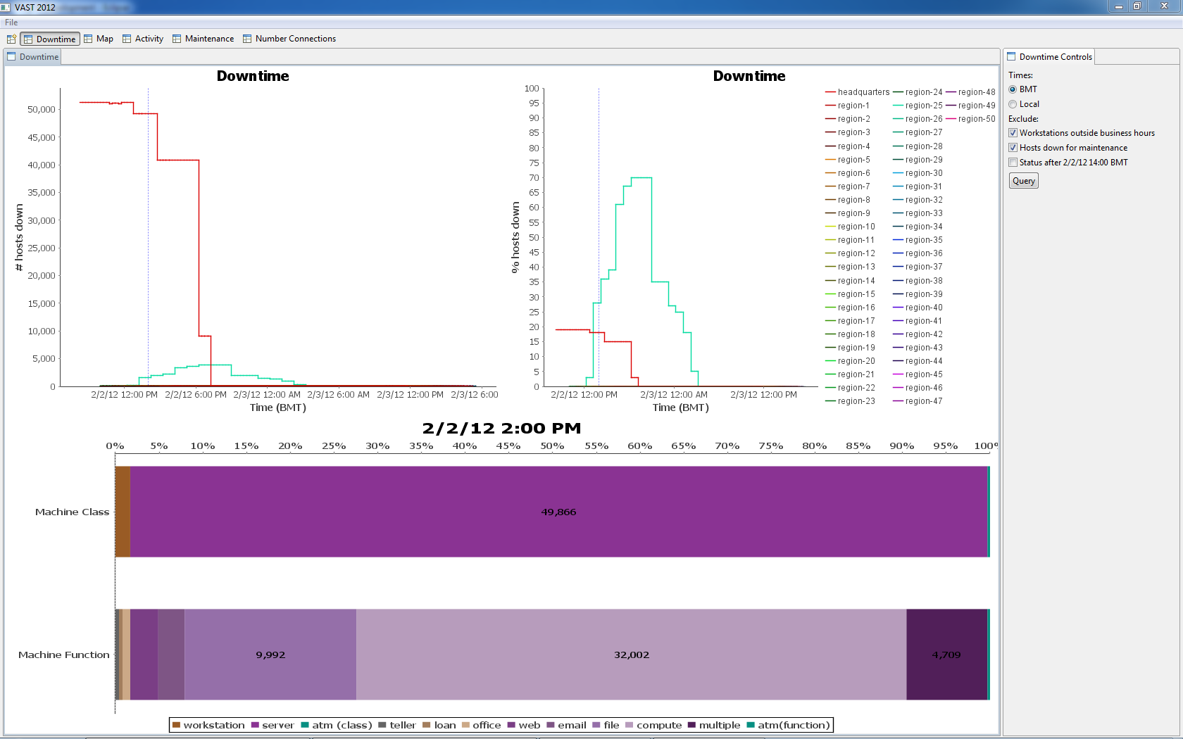
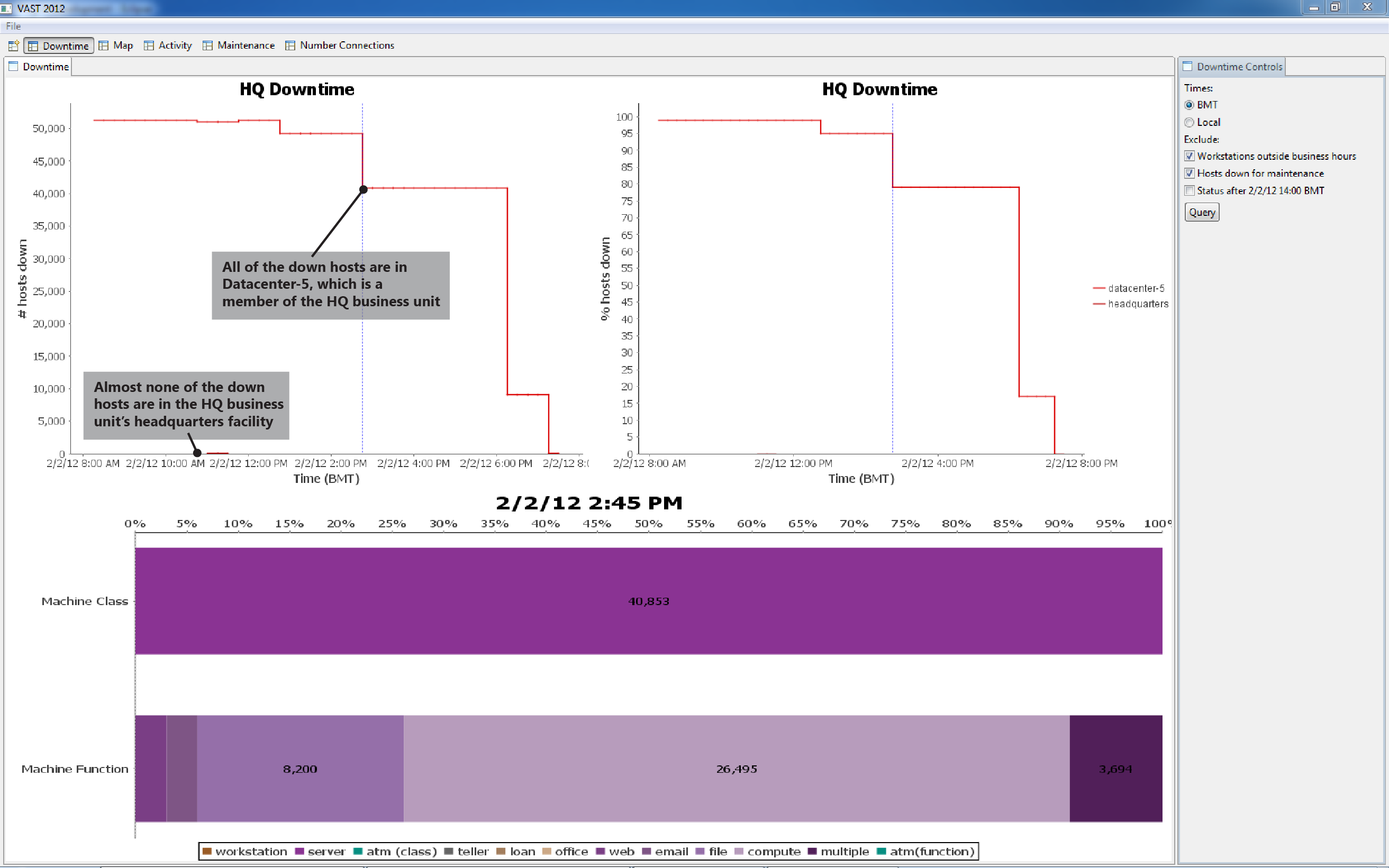
Figure 8 shows the unplanned downtime in HQ and Region-25. We see in the Figure 9 drill-down that most of the downed hosts are within datacenter-5.
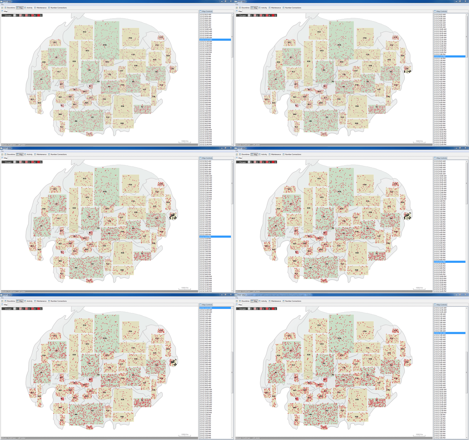
Region-25 experiences downtime across all hosts in 16 of its facilities.
4. Workers don't power up their workstations for up to 45 minutes after 07:00 local time
| BEGIN | 2/3 07:00 local time |
| END | 2/3 07:45 local time |
| EXPLANATION | People either show up late to work, or don't get around to turning on their workstations for up to 45 minutes after they arrive. |
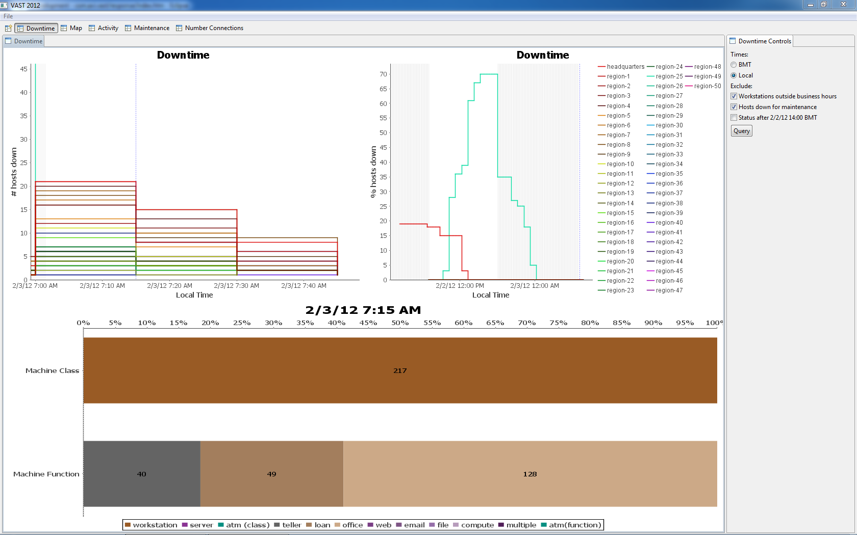
Figure 11 shows host data on a "local time" x-axis. Here, hosts in different time zones have been organized so that their downtime data appears by local time (e.g., 07:00). On the mornings of both 2/2 and 2/3, workstations appear down as late as 07:45 local time. This is relevant because BOM business rules state that business hours begin at 07:00 (in the local timezone).
On 2/3 at 07:15 we see 217 workstations not reporting status; we assume that these workstations have not yet been turned on. Most of these workstations are office computers (56%) – fewer are teller workstations (only 18%). This difference may refect that it is more difficult for customer-facing tellers to show up to work late than office workers.